Sunday, March 29, 2020
The depth of the recent collapse requires a longer term perspective to look for price levels that would have the highest probability of supporting a bottoming of the Corona Crash. In situations like this we need to zoom out and look at historical data from a macro perspective as broader market equity prices have broken all support levels from 2017 forward.
When examining very long term return data it is helpful to examine log scale charts to give us a clearer picture of what a recovery might look like based upon return trajectories of longer time periods. I generally use arithmetic charts when observing shorter term time periods.
For those of us with equity exposure we want to know when the bleeding will stop and for those of us who want to take advantage of potential long term lower valuations we want to know what those entry levels look like.
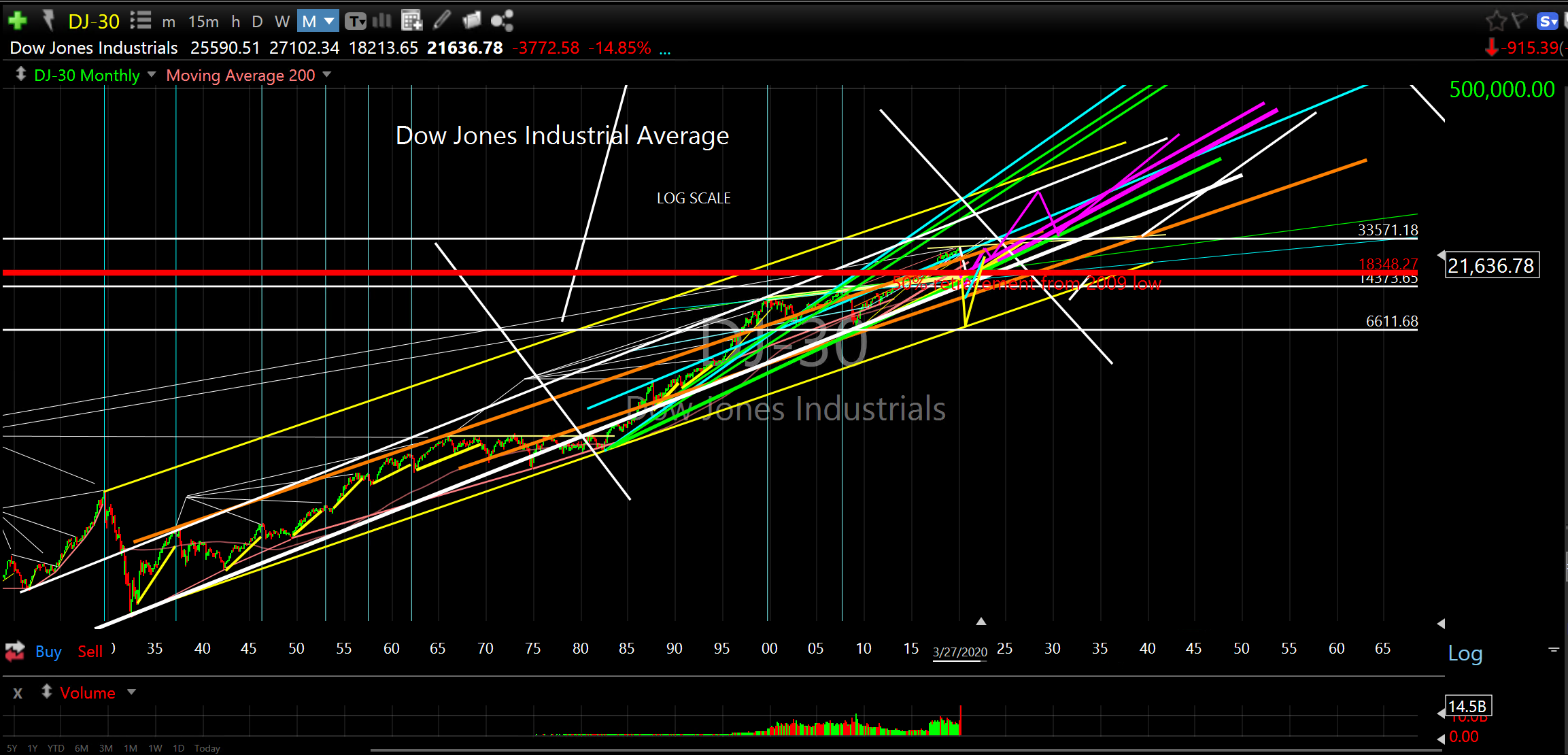
This first log chart of the Dow from 1919 gives us context to see where price is relative to long term return extremes. You can see current values are relatively neutral in this context and about equidistant from the upper and lower brackets of price values (the top and bottom ascending yellow lines).
DJ-30 Log Scale 1919 to 2040
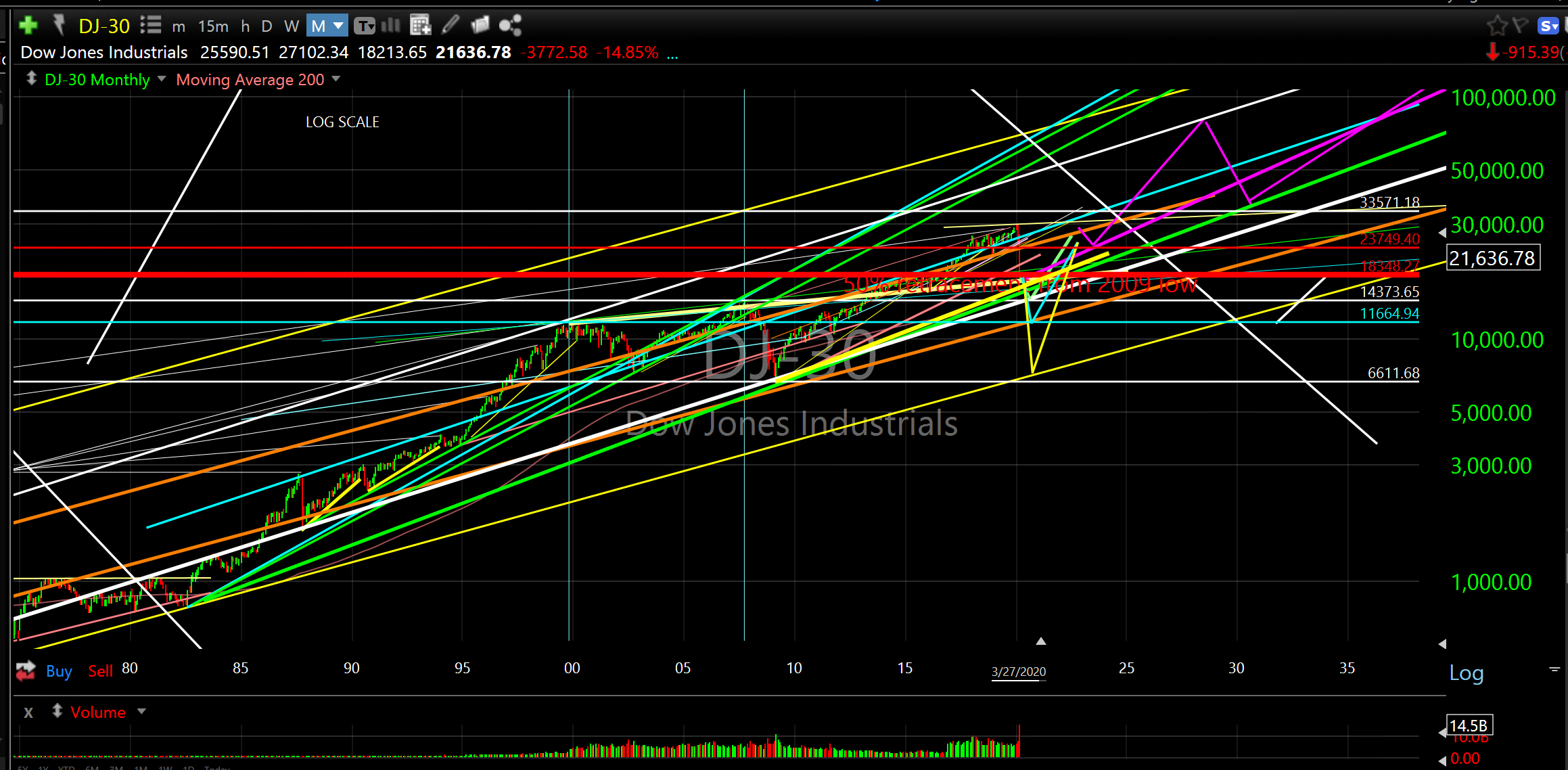
The second log chart of the Dow from 1980 shows historical perspective from when price last traded at this lower yellow bracket. It’s also interesting to note that since then, price has never traded below the green ascending support zone which was established by the 1987 and 1990 lows. In addition, this green ascending support zone is exactly where price culminated its decline in March 2009 and began its reversal higher. Think about that. The financial collapse bottomed and reversed higher from an ascending support level that was established 20 years prior to this all important reversal bottom.
DJ-30 Log Scale 1980 to 2035
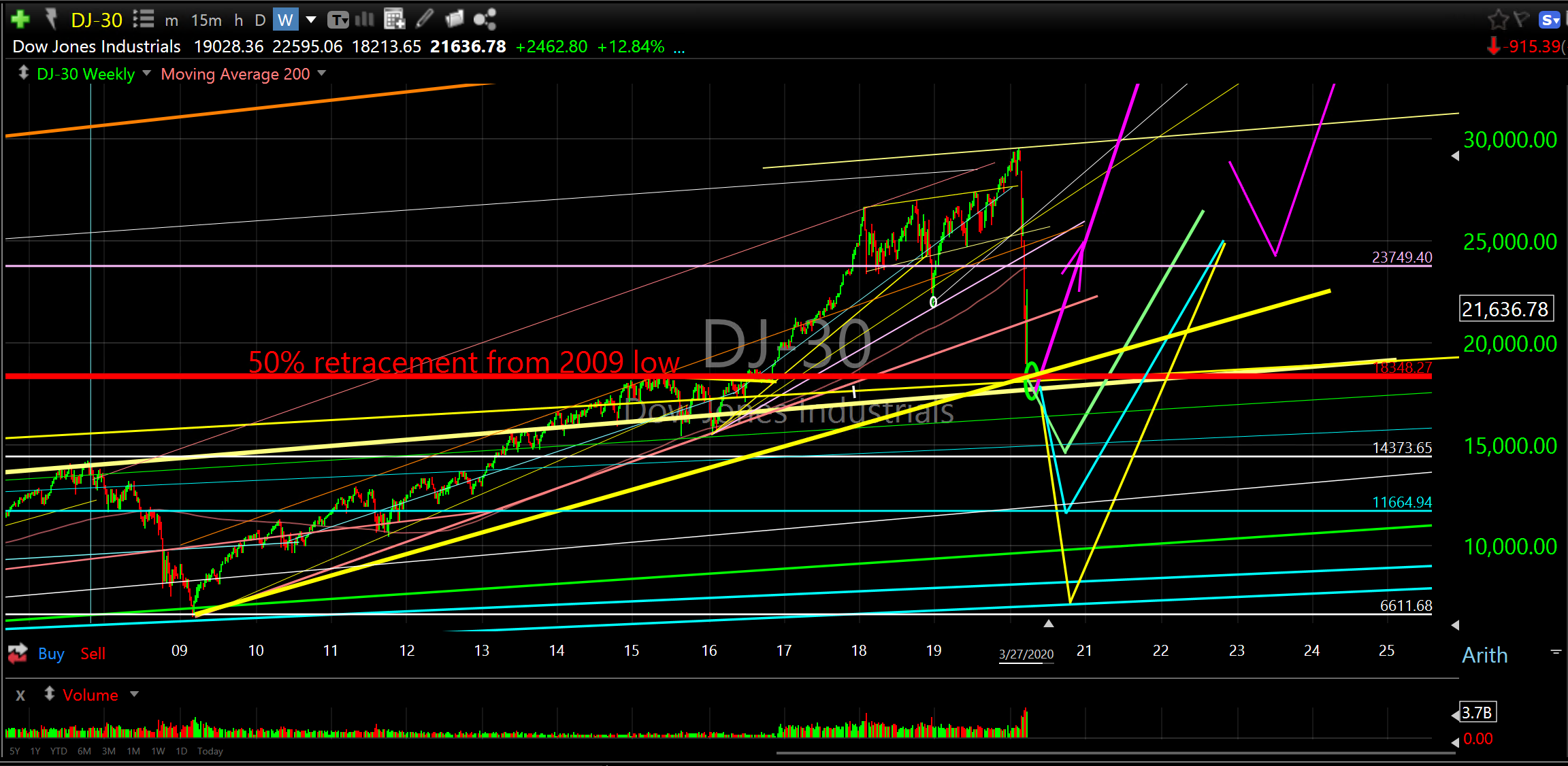
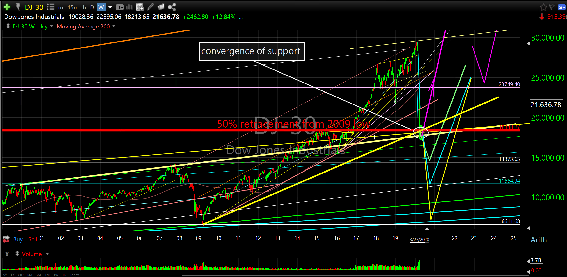
The third chart of the Dow is from the bottom in 2009 in arithmetic scale. What’s important to note here is the current retracement of the 2009 low to the recent high. Price has retraced (given up) half of its gain from the bottom put in eleven years ago. This is a very common retracement percentage that is seen on all time frames. It is also exactly at the breakout point that occured in November 2016 when the broader market began its surge higher after consolidating for three years.
Obviously, it was highly unusual to give up half of the gains in one month that took eleven years to gain. Astounding.
DJ-30 Arithmetic Scale 2009 to 2035
The next chart is a daily chart that gives us a close up view of the collapse from the peak just 25 trading days ago. Note price bottomed and reversed higher off this exact 50% retracement zone. This tells us there is strong demand at this level. As I have discussed here over the past week there is a great deal of evidence that this is the current support level that needs to hold. I wrote about this Monday night at the recent extreme bottom before the surge higher began on Tuesday morning. The confirmation reversal proves the accuracy of identifying the demand at that level.
DJ-30 daily from collapse
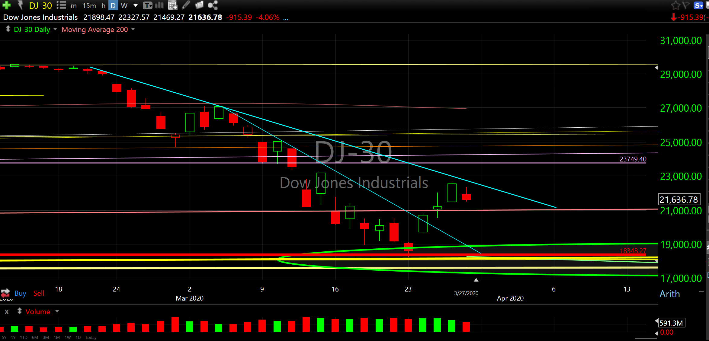
As we have witnessed over the past month it is critical to understand and identify these important levels. When a critical level fails it is indicative that price will likely default to the next critical level. Dow 18,213.65 is now that line in the sand. If we don’t hold this level the next critical support level is Dow 14,000.
There is a lot of talk about the rip higher we had last week with comparisons to the 1930’s and the possibility that it is a head fake rally giving investors a false sense of hope. Of course, anything is possible, however, that doesn’t mean we won’t bottom and that doesn’t mean we shouldn’t identify the highest probability reversal zones that will eventually form a multi year low.
The following chart is a closer look at the highest probability reversal zones if the current reversal bottom doesn’t hold. Please note the current reversal bottom is a high level support zone with multiple support convergence and that breaking below this level would be a significant negative event.
DJ-30 critical support reversal zones
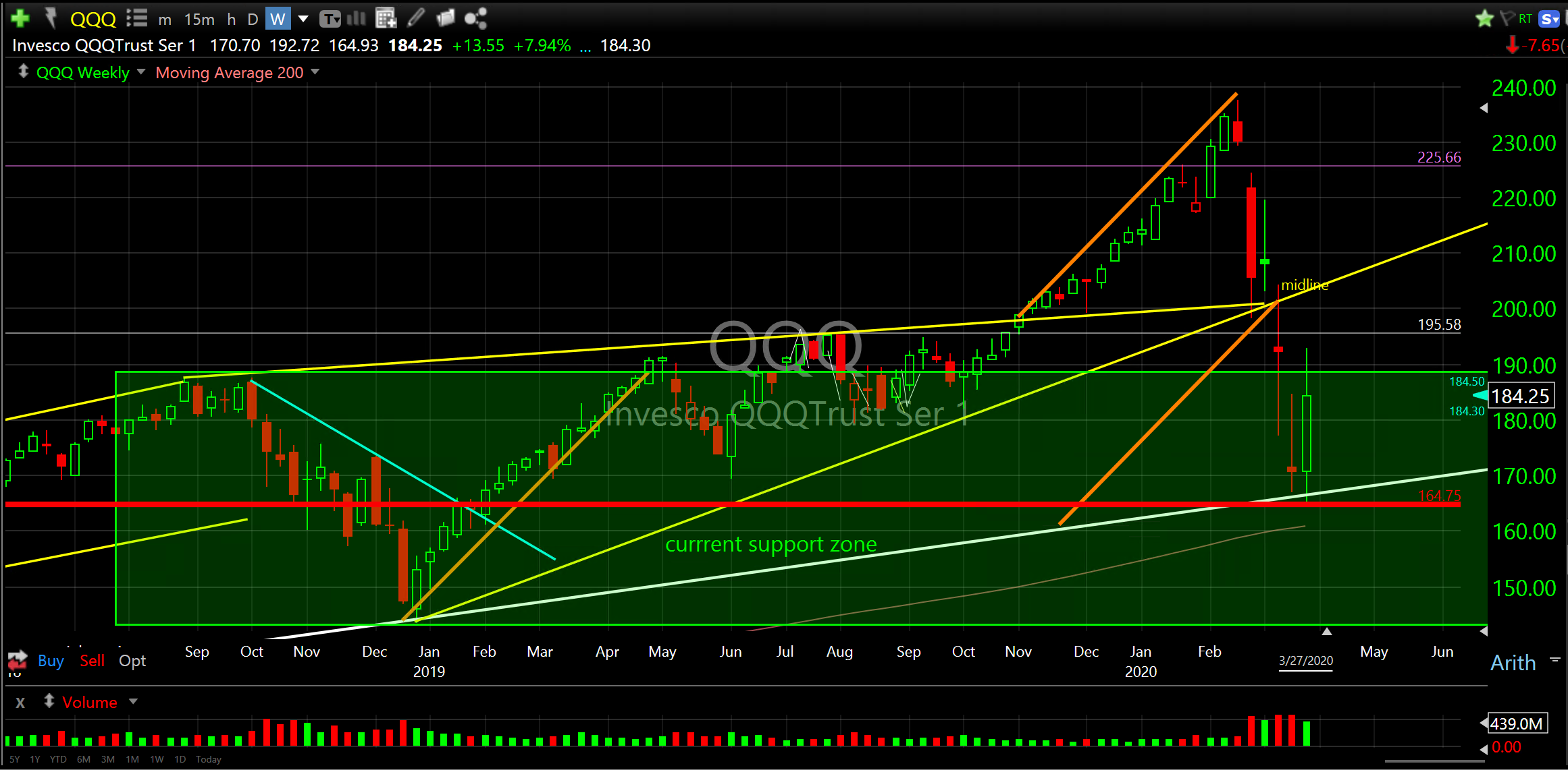
The next chart is a weekly chart of QQQ, the Nasdaq 100 ETF. You can see last weeks’ surge off the extreme lows I described Monday night before the surge began, “If they do hold we can make a case for the end of the decline and the beginning of the bottoming process. The Dow, S&P 500, Nasdaq, technology sector and semiconductor index are each positioned at these critical levels that are logical places to bottom and any failure here would signal further declines.” Well, that’s exactly where we bottomed and we want to see this level hold. Every broader market proxy looks almost identical to QQQ. The horizontal red line is our line in the sand.
Invesco QQQTrust Ser1 (QQQ) weekly
As an active investor, I treat these price zones as tactical response levels. These are the levels to be aware of when incrementally increasing or reducing risk. Hopefully, the economic bridge our government and Federal Reserve are providing will help stem the collapse and provide a floor for future expansion.
Hope,
Don