The What
The broader market, individual sectors, gold, oil, interest rates and small caps are all positioned as expected. The expansion is playing out pretty much like I have been describing for most of the year. The charts have projected virtually every significant broader market reversal this year. All archived published research/trade ideas here. The Dow, S&P500 and Nasdaq are all following my price forecasts higher like they have been reading my mail. Sectors are moving correctly. Gold and oil are positioned right where they should be. Small caps are beginning to expand right on track. Interest rates reversed and are positioned exactly where I projected. China is moving beautifully. Japan has followed the projection track like a Chinese fortune cookie. Most of the individual stock price projections/reversals/alerts I have shared with you this year have not only been profitable but “off the charts” accurate. There are just too many profitable trades to list here. To say the least, 2019 has been a good year.
The How
The repetitive cycle rotation characteristics of broader market proxies, sectors, subsectors, individual stocks, yields, metals and commodities can be so evident that it is sometimes like reading next month’s newspaper. It is these characteristics and properties that allow for accurate forecasting. It is these characteristics and properties that reveal the reversals that allow for highly accurate entries and exits. It is these entries and exits that allow us to buy low and sell high. Reversals reveal the birth of expansions. Reversals reveal the beginning of collapses. They allow us the opportunity to understand what others don’t. They provide a glimpse into the future.
The Why
You can call it Price Projection, Predictive Modeling, Luck or Probability Forecasting, I don’t care. All I know is this…I have been in and around this business for decades and I still see the analytics that just don’t work very well in real-life buying and selling. I know what I do works better for me than anything else I have been exposed to. And I know when it doesn’t work and the price goes “off track” that there is something wrong fundamentally. And that my friend is priceless. Remember, the foundation of all charting should be rooted in risk management. Risk management should drive all entries and exits.
The Result
It has been a rewarding year on so many levels. To see the market play out as expected is reward in and of itself, but to have so many accurate and profitable trades is pretty special as well. The real gift though is if I helped you. I truly hope I accomplished that.
All Entries and Exits are listed on the Trade Alerts page. Oh, and by the way, Bitcoin was the best performing asset class during 2019. We were right there to scoop it up. I suggested a buy entry on March 4th, virtually at the bottom ($4.40) of a 90% collapse from 2017. It proceeded to ramp to over $17.00 and we were able to capture blockbuster gains. You can’t do this with fundamental analysis. Have a look at the chart.
GBTC

The Where
Broader Market Review
OK, let’s look at some important charts. DIA has followed the price projections I drew in on November 7th like an Uber Pro. I projected these reversals almost to the exact day and price. The broader market is behaving exactly as it should during this stage of the cycle; strength off support and separation from what was a 22-month ceiling and what is now a floor. The expansion is underway.
All sectors are positioned properly. Interest rates are positioned properly. Gold and oil are positioned properly. Small caps are positioned properly. The sentiment is positioned properly. The world is even positioned properly. As I told someone the other day, “it’s almost too good to be true but I think it is”.
The following charts tell the tale of the expansion…
DIA…Dow ETF

SPY…S&P 500 ETF

QQQ…Nasdaq 100

XLK…Tech Sector

XLF…Financial Sector

IWM…Small Cap ETF

TNX-X…10 Year Treas Yield

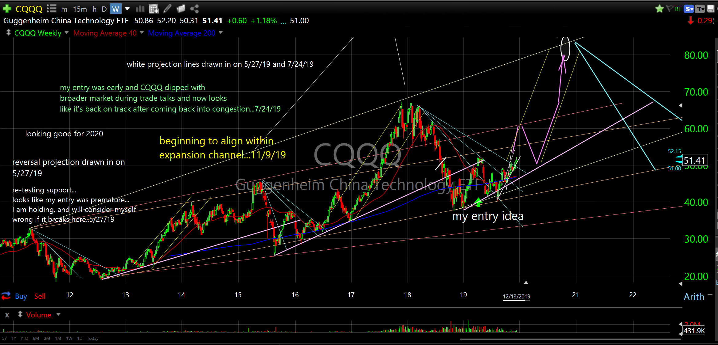
CQQQ…China Tech ETF
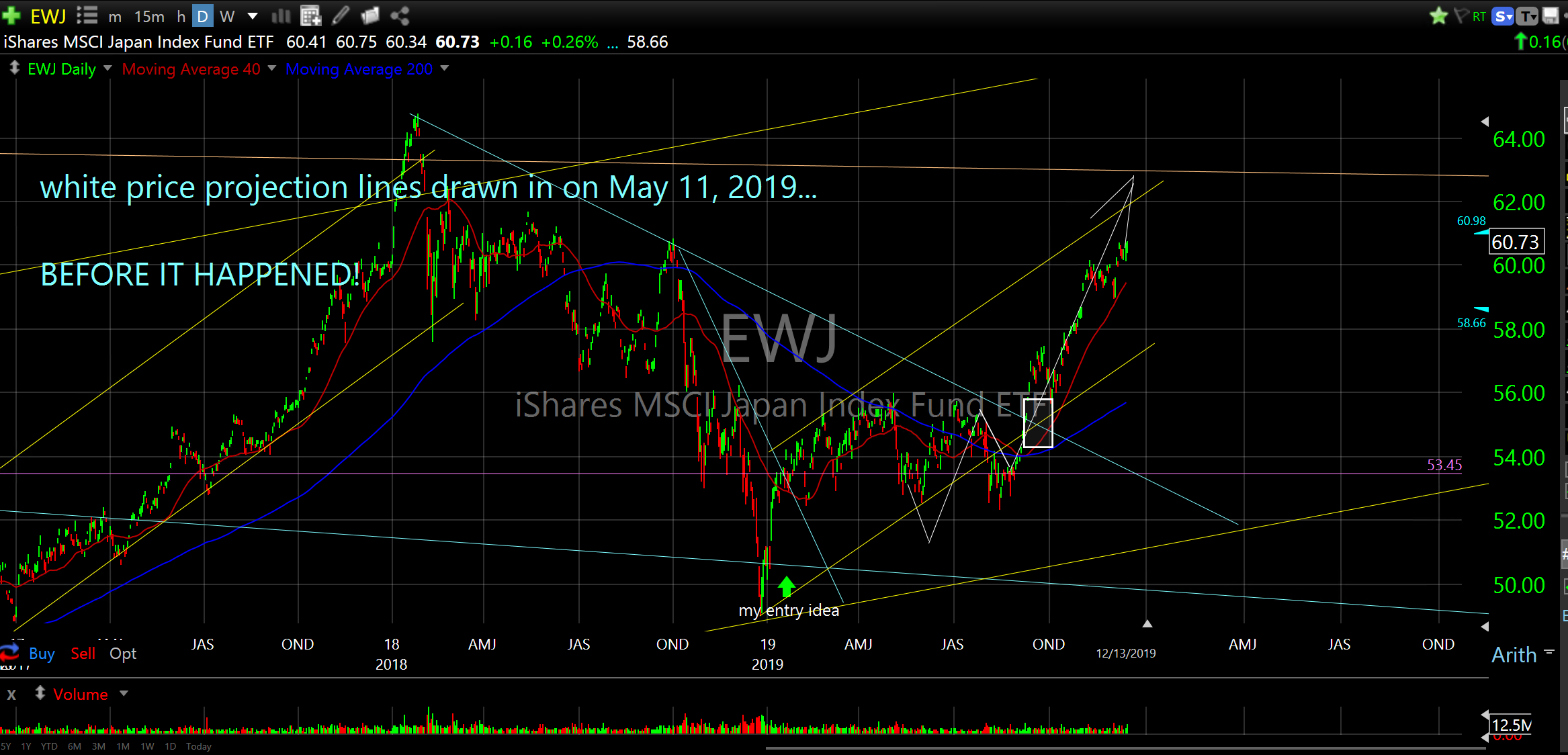
EWJ…Japan Index Fund
VT…Total World Stock ETF

The Forecast
I expect a rip-roaring 2020. Over the past few months, I have published my favorite index, sector, subsector and country ETF’s including many individual stocks positioned well for the 2020 expansion. You can find them all here. They are listed in my recent weekly updates and many of them are on the Trade Alerts page under Entries on my website.
The Charts of the Week
This week I share a random mix of charts I find pretty compelling. I’ll take you behind the curtain to view long term historical charting and share a couple of my favorite deep dive charts. We will have a look at the potential breakout in weed stocks (CGC). We’ll take a look at the one that got away (TSLA) but still catchable. Just look at the reversal circle I drew in on May 29th! I still have it there on the chart today. Zoom Zoom. Up 90%. That should leave you speechless. Oh, and I drew in the white price projections on August 9th! Just like reading next month’s newspaper. Remember? I was too afraid to make the trade. My emotions got in the way…charting is supposed to help with that human condition. Damn, I bet it’s going to $500 like a slot car on steroids.
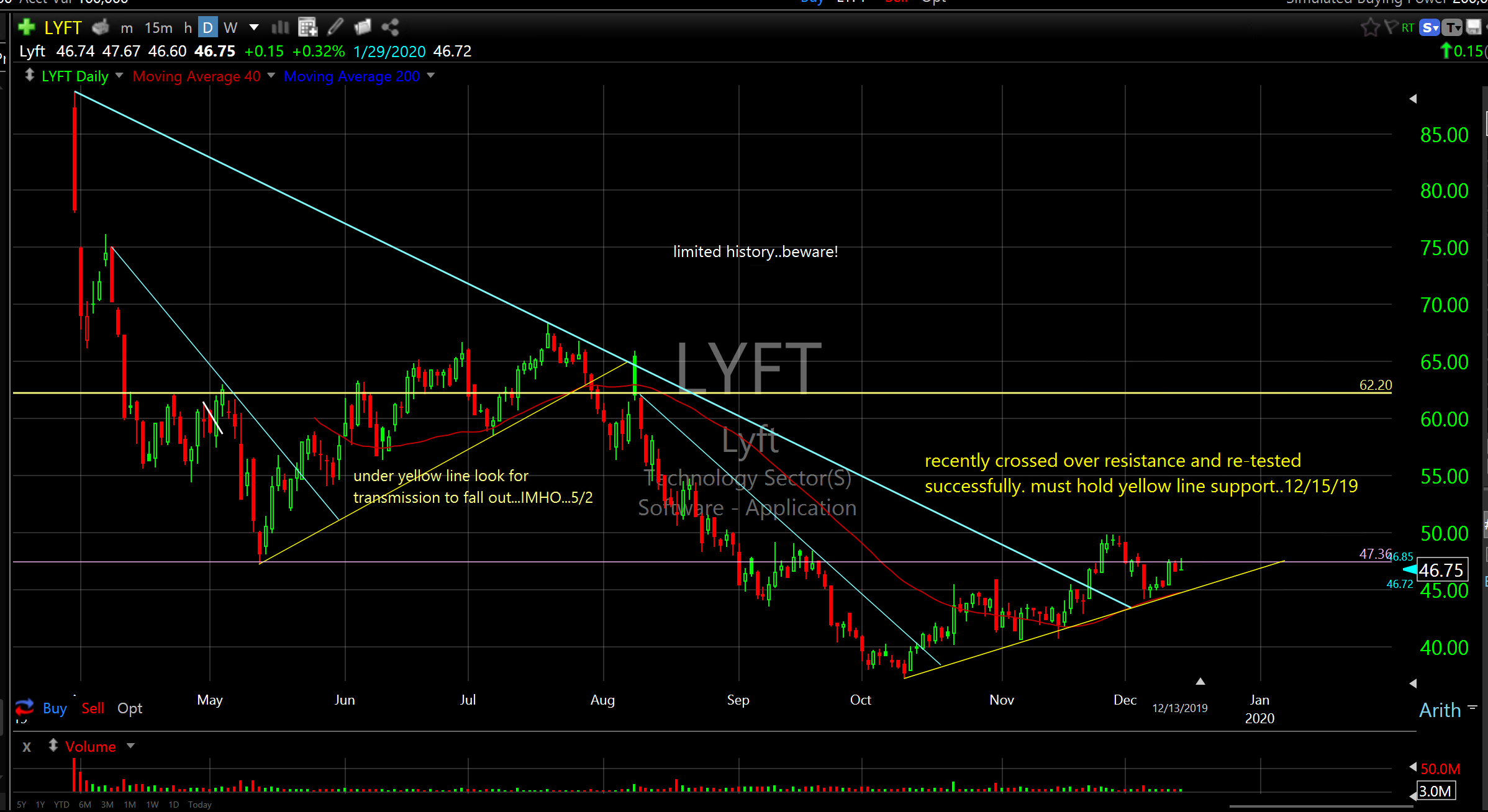
We’ll look at a 27 state casual dining operation (BJRI). We’ll look at a few 3D printing companies. We will check out UBER and LYFT. We’ll have another look at China technology and what might be on the horizon there. Plus, a look at a little Chinese online entertainment company that looks ready to bust out. And finally, we will check in on that little steel company, Ak Steel Holding Co (AKS). Let’s go exploring together…
DDD, PRLB, and HPQ provide three-dimensional printing products worldwide. The DDD charts will give you a glimpse of what goes into historical price data analytics. The first chart, from 1991, is what most people see when they look at a chart. The rest of the charts are what I see (sometimes it helps to squint your eyes to see what’s going on). It would be impossible to explain the process I go through without doing a video but if you study closely you might be able to see the similarities between the left side of the peak and the right side of the peak, in addition to the long and short term bottoming process. Look for the price reflections. Look for the mean running through the middle. Look for the consistencies in time and price. Look for the repetition. Look for the channels and reversals. Look at the support violation and recovery in 2009 and note how it is recurring again now. So much to see if you really, really look.
The weekly chart for PRLB, on the other hand, is simplified and very easy to read. Look for the yellow ramp channels and blue collapse/consolidation channels. These channels occur during repeating cycles for all instruments. Find the cycles and discover the channels. Discover the channels and unearth the reversals. The holy grail is inside the reversals.
Study the charts below. Take your time. Really look at the charts and “see” what is really going on. Trust your own eyes. Be objective. It’s all in plain sight.
3d Systems Corp (DDD)..no line….weekly..1991-2020

3d Systems Corp (DDD)..weekly..1993-2009..left of green line

3d Systems Corp (DDD)..weekly..2009-2016..between the green lines

3d Systems Corp (DDD)..weekly..2016-2024..right of green line

3d Systems Corp (DDD)..daily..2016-2022..

3d Systems Corp (DDD)..daily..2019-2020

Proto Labs, Inc. (PRLB) weekly

Hp Inc (HPQ) weekly

Canopy Growth Corporation (CGC) daily

Tesla Inc (TSLA) daily..5/29/19

Tesla Inc (TSLA) daily

BJ’s Restaurants Inc (BJRI) weekly

Uber Technologies (UBER) daily

Lyft (LYFT) daily
Guggenheim China Technology ETF (CQQQ) weekly..2012-2022

iQIYI Inc (IQ) daily

Ak Steel Holding Company Corp (AKS) weekly..1998-2022

Ak Steel Holding Company Corp (AKS) weekly..2012-2021

Phase one China Deal done! Here we go.
Happy Charting,
The End
Don