As you must know by now I love the stock market. I watch it everyday and go so far as to study intraday price action. This helps me “see/feel” the tension at the important supply (resistance) and demand (support) zones. Simply put, it helps me evaluate who is stronger; the buyers or the sellers. Sometimes I can get too focused on the shorter term (a side effect to limiting losses) so it’s always good to stay focused on macro price action.
Support and resistance zones have varying degrees of importance based on time. The longer a trend line is the stronger a trend line is the more important a trend line is.
Remember, all of the important price levels I annotate on a chart can be either support or resistance. Support is always below price and resistance is always above price. Once price has passed up and through a resistance zone this zone becomes support. Once price has fallen through a support zone this zone becomes resistance.
Look at the first chart. It’s a daily chart of SPY.
SPDR’s S&P 500 Trust Series ETF (SPY) daily
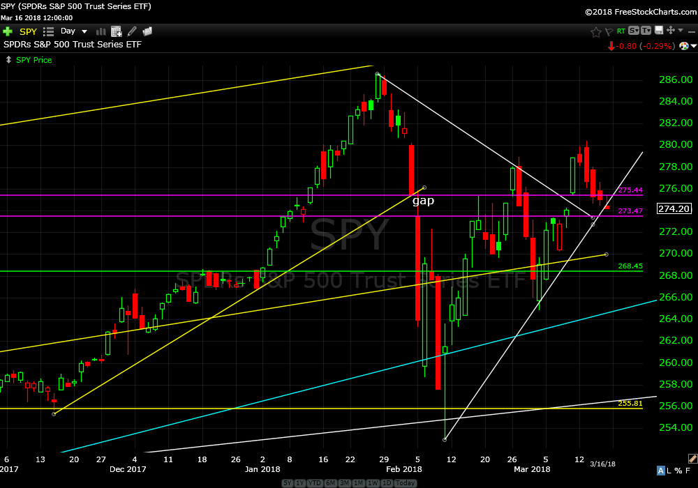
You can see where I have drawn support and resistance. These price zones range from weak short term to strong long term. Last week price broke down through weak short term support (the steep upwards sloping white line). What do I think?…Meh. Unless you are day trading this is not really important.
SPDR’s S&P 500 Trust Series ETF (SPY) monthly
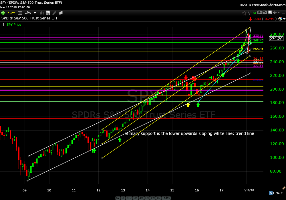
Widening our lens let’s look at a monthly chart from the bottom in 2009. You can see from this chart that the upwards trend is still alive and well. Also, it’s easy to see that price should revert to a more sustainable upwards slope that isn’t so steep. Price could revert to rising primary support from 2009 without violating the current uptrend. This would be painful yet not out of the ordinary.
SPDR’s S&P 500 Trust Series ETF (SPY) quarterly
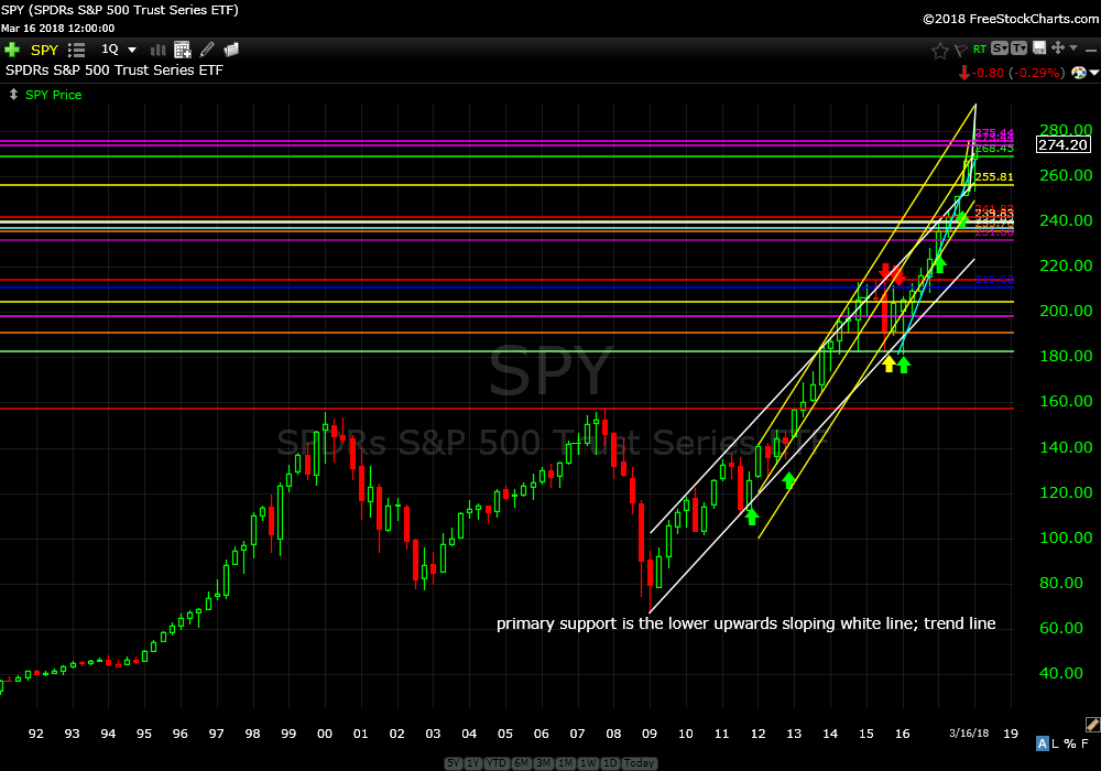
The quarterly chart shows price action from 1989 which includes the two most recent large corrections and subsequent bull markets. The bull market from 2009 can only be described as “giddy up buttercup”.
I don’t see any big macro shifts yet but I do see recent price action that could be described as a shankopotumus; a really bad golf shot that can be the beginning of the end…or it could just be a momentary fright.
Not to worry. I’m referring to interest rates, $US, financials and energy. More to follow this week. I promise I won’t write about how the yield curve effects our currency in a rising moon during a complete decentralization of our monetary and banking systems at low tide.
Continue to hold all open positions.
Trade Smart,
Don