Today let’s take a look at a new buy opportunity, then I want to walk you through some specific examples of how a trade like this should work moving forward.
Obviously, not every trade works as planned, but that’s why we are prepared for all situations; which is also why we are so successful.
Avalon Communities (AVB) is set-up right within our framework for a nice entry point.
Price has been moving sideways for about two years (see highlighted area in below chart) and has recently tagged support.
Avalon Communities (AVB) weekly
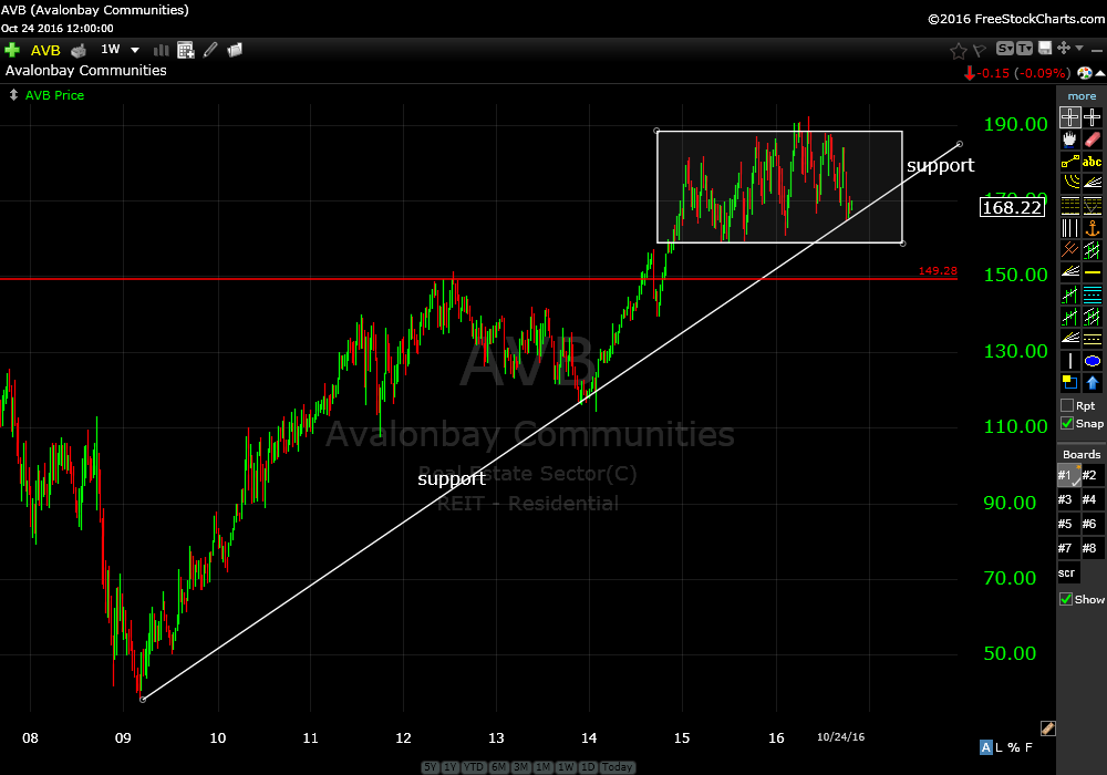
This is a good entry. First level of risk is under support (white trend line). If you want to take wider risk the next level would be the red horizontal line at just under $150.
AVB also pays a nice dividend over 3%.
Why is this a good place to buy?
Let’s take a look at what constitutes a good entry point. To give you an idea of how this trade should look moving forward take a look at Dominos Pizza Inc, DPZ.
Dominos Pizza Inc. (DPZ) weekly
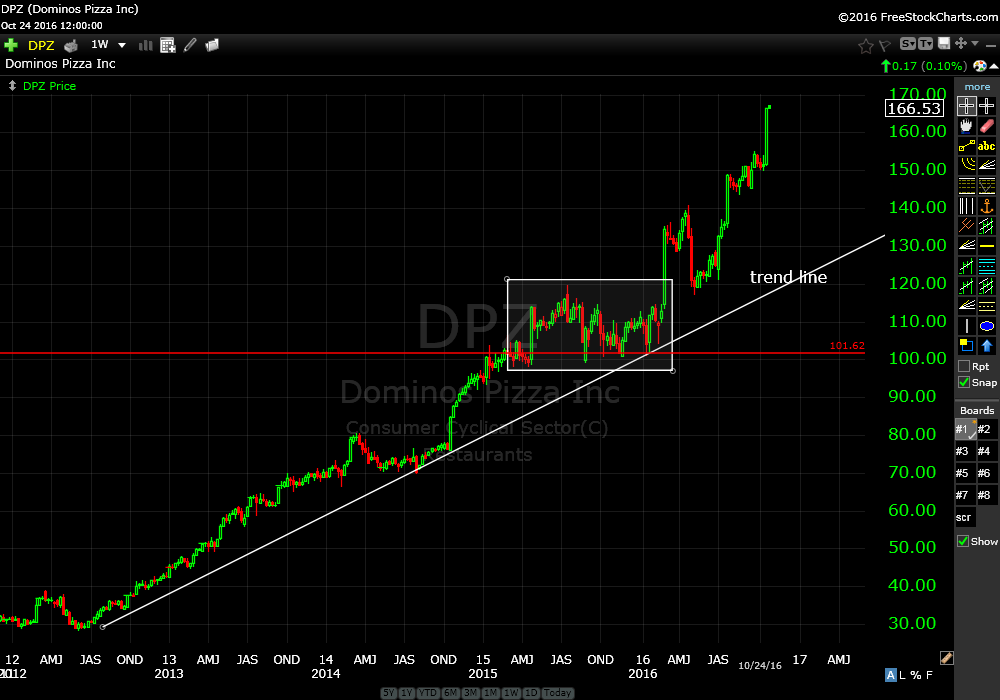
This was a very similar set up and you can see what happened when the trend line was tagged after trading sideways for nearly a year (see highlighted area above).
That’s what we are looking for with AVB.
Trend lines are the building blocks of framing price. I always begin with a macro look with either a monthly or quarterly chart and then on to more micro perspective from weekly, daily and intraday charts.
Trend lines can be used to help with entry and exit.
Look at the weekly chart of Tyler Technologies (TYL).
Tyler Technologies (TYL) weekly
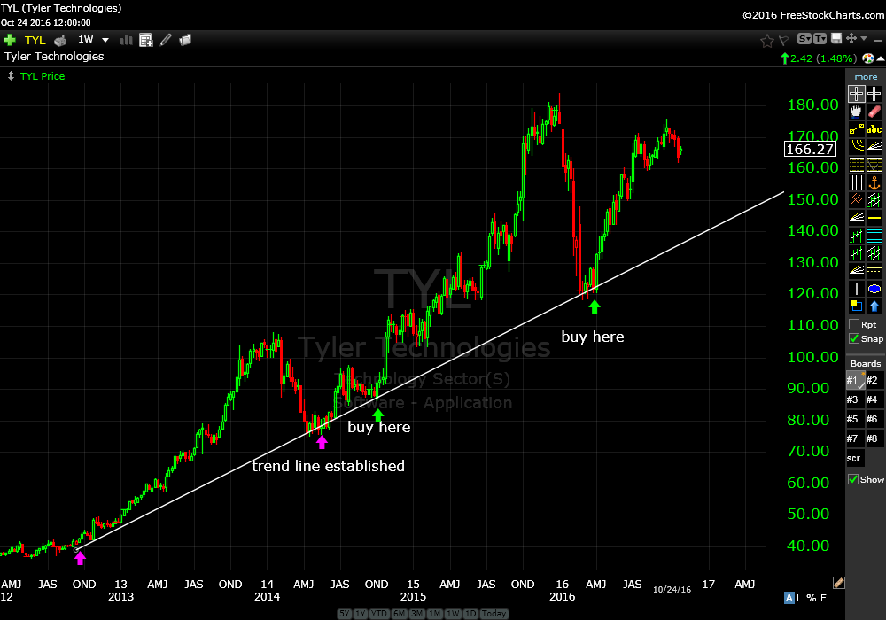
The trend line was established simply by connecting the two lows at the purple arrows. Once a trend line is established you can continue to accumulate positions every time the trend line is tagged, see green arrows.
A simple way to know when to sell.
Now let’s look at how we know when to sell.
To exit the trade look at the chart SAM.
Boston Beer Co (SAM) weekly
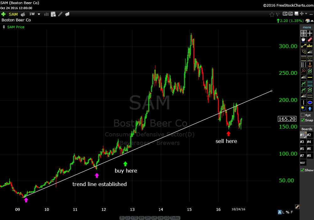
Simply exit when the trend line is broken. See red arrow.
You can always adjust your risk tolerance by creating shorter term trend lines, which would have had you exit nearer the top in the SAM example above.
Is it a coincidence that price tends to revert to a “mean” and then bounce consistently off a trend line? No, it happens over and over and over…
Look at the chart for BIO. Just rinse and repeat.
Bio-rad Laboratories inc (BIO) weekly
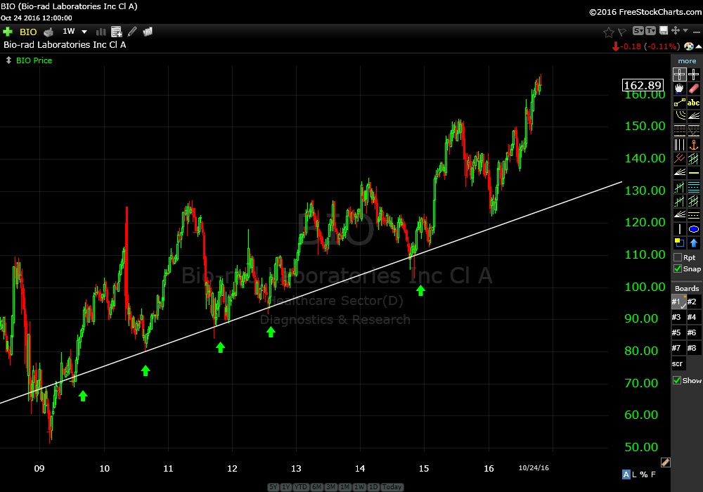
What does it mean when price doesn’t bounce and falls through the trend line? It’s a bearish sign as that support level has been broken. It means it’s time to get out to either limit losses or capture gains.
There are many tools to frame price action. I always recommend drilling it down to just a handful. If you are new to charting I recommend starting with trend lines.
Remember, it’s all about managing your risk and position size.
Trade Smart,
Don Roth