Impeachment concerns: gone. Coronavirus worries: hopefully waning but probably providing multiple lower entry opportunities. Foreign military issues: “normalized”. Trade wars: not so much. Recession talk: blah, blah. Tesla rip: unbelievable (Go Elon). Dow reversal off bottom last week: just beautiful. Bitcoin bottoming? maybe. My 50th high school reunion this year: Holy @!#&*! Batman!
Broader Market Review
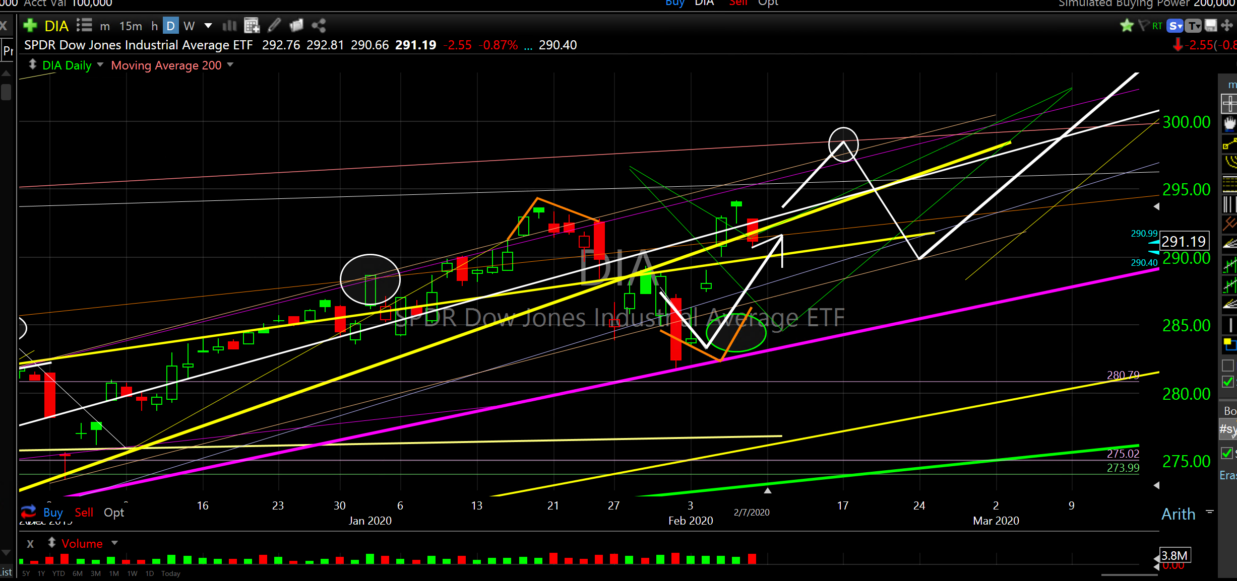
What a wild week! The Dow reversed higher as projected last week. It bounced precisely when and where I forecast. And, what a rip it was. Up almost 1,000 Dow points from my reversal.
This is what I wrote on February 2nd, at the bottom of a nine day 1,150 point Dow drop.. ” It’s just another old fashioned good buying opportunity. ” Most everyone else was screaming to get out of stocks and buy bonds. Blah, blah, blah.
SPDR Dow Jones Industrial Average ETF (DIA) reversal week
As you can imagine, I’m a voracious consumer of what everyone else in the research world is saying. Every day, I just can’t believe the crap that passes as advice or research. Here is what another analyst said at the very bottom after last Friday’s close, 1200 Dow points ago…”This is a market environment where we want to be selling stocks, not buying them.” I think fear got the better of his lack of conviction or understanding. He’s blowin’ in the wind.
This move caught everyone off guard. There was so much negative sentiment last week that Punxsutawney Phil was even afraid to emerge from his burrow. My outlook remains unchanged: a robust expansion in 2020 with the usual chop, a typical weak summer, a higher ramp into the election and then caution.
Expect multiple support reversals that will offer buying opportunities along the way up. The lower ascending pink line should provide a rising floor that can be bought on each dip for the next few months. Price may default down to the lower, ascending yellow line support (good buy zone), however, that is more likely to occur in the seasonally weak summer months when that price level will be higher.
Shorter term, I would expect another dip soon due to the strength of the move up last week but that would be a normal pullback from the market getting stretched too far too soon. My longer term forecast remains unchanged: higher.
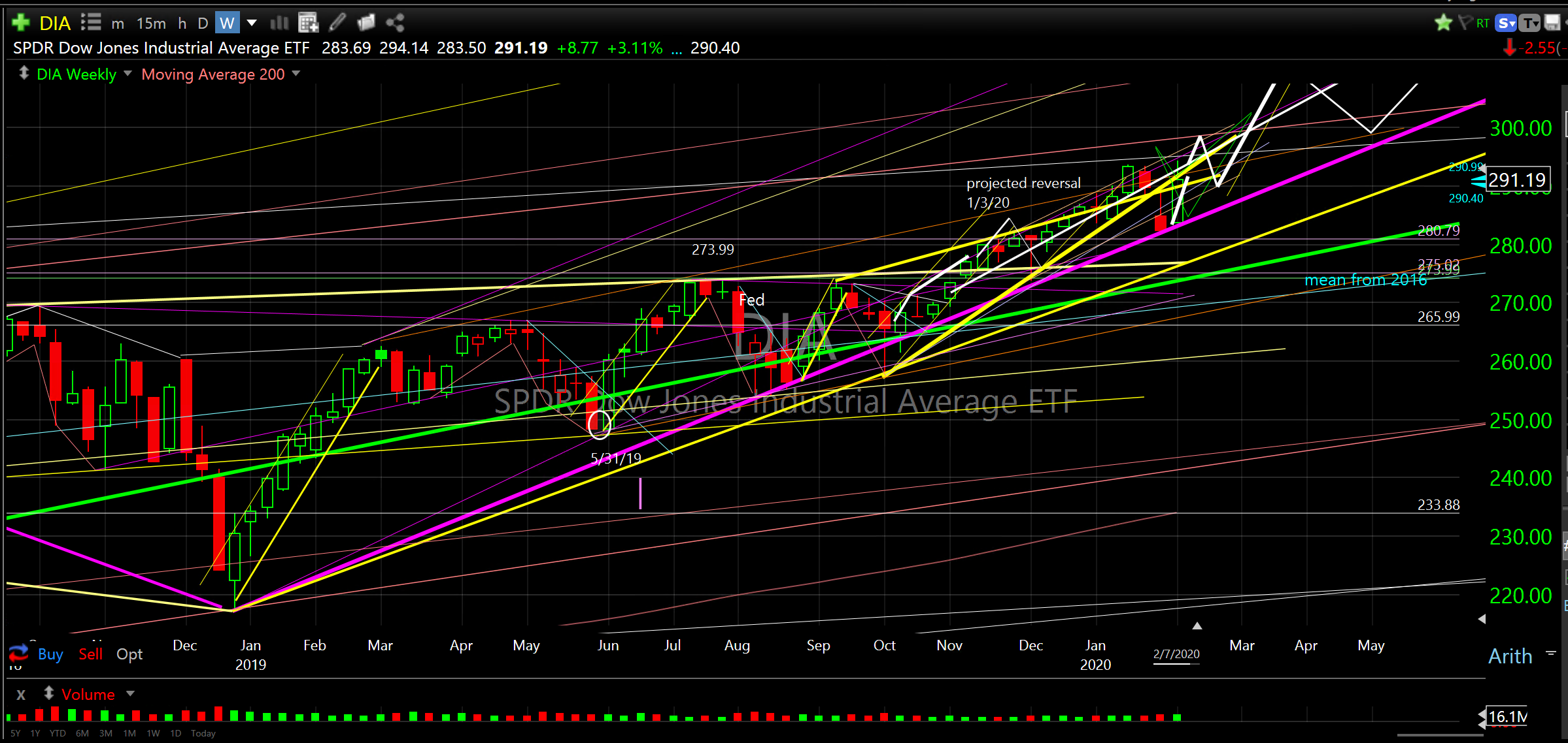
SPDR Dow Jones Industrial Average ETF (DIA) January 2019 to May 2020
Not all stocks will go up. Even in a rising tide some will not fare so well. To name just a couple, I would avoid Boeing and Altria. I would also avoid gold and energy. Commodities are still stuck in a long downtrend that is not likely to reverse until 2026/2028. Sure, there will be reversals off support but likely no longer term cycle higher for many years.
Exit Ideas
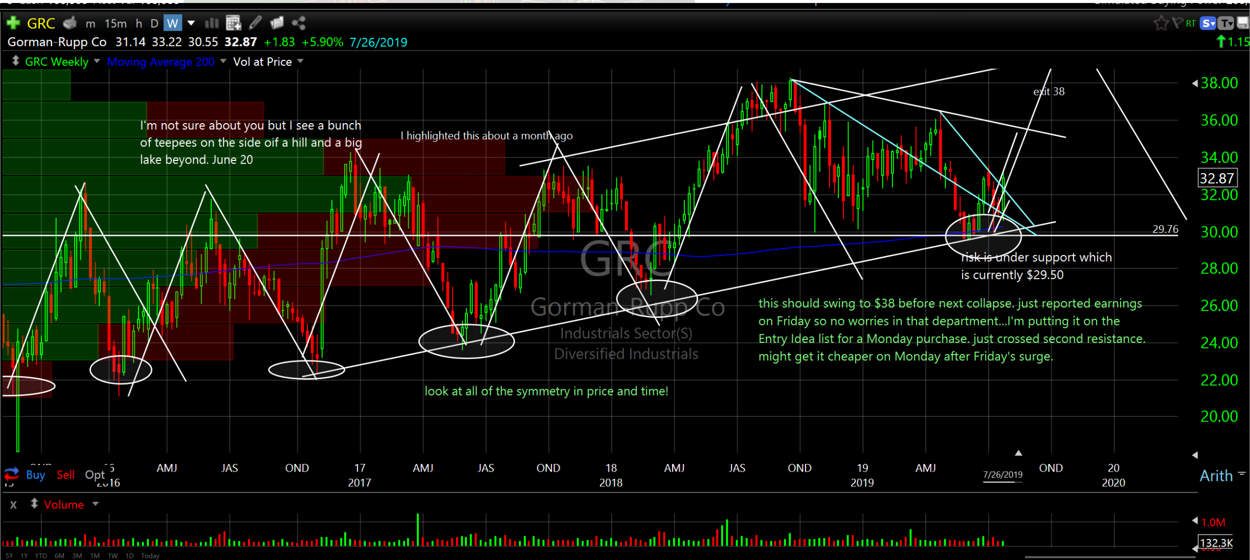
Speaking of teepees, do you remember this chart? I shared this last June. The accuracy of Cycle Positioning Analysis still blows my mind every day. Look at these before and after charts of Gorman-Rupp Co (GRC).
The Entry chart (before), which I created on 6/20/19, shows my projection of price going to $38. At that time GRC was trading around $30. Look at the “teepees” I drew in and look at the “teepee” projection I drew in where I forecast price going to $38.
Gorman-Rupp Co (GRC) Entry chart..Before
The Exit chart shows how price followed the left side of the projected “teepee” exactly as I forecast right to the $38 target. Is that not the most beautiful teepee you’ve ever seen?
Gorman-Rupp Co (GRC) Exit chart..After
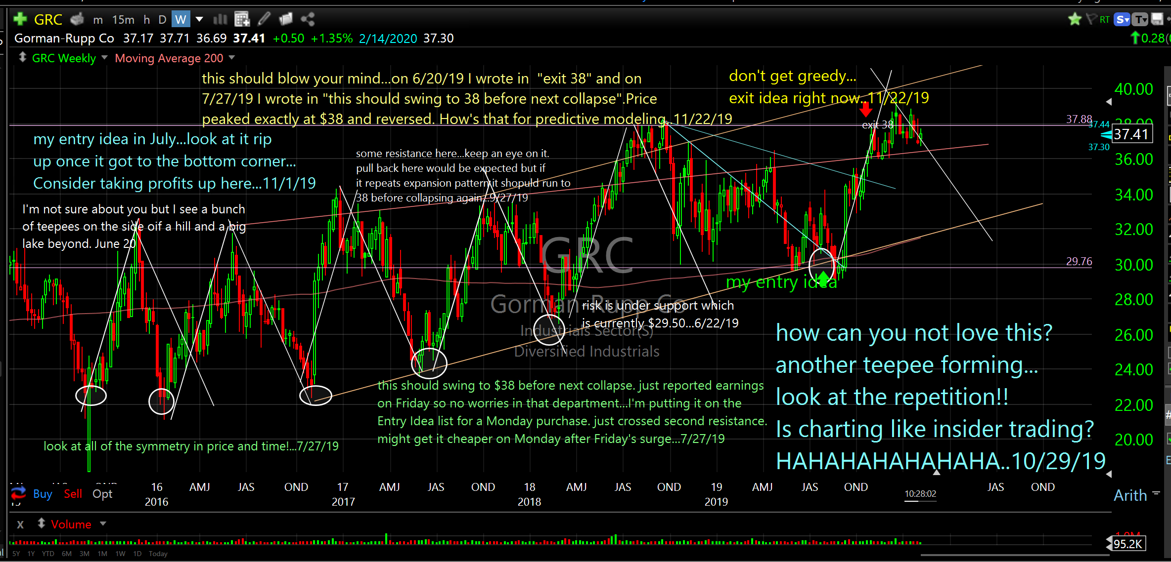
Time to exit the remaining position. I suggested a partial exit on 11/5/19. That day the exact, original target high was $38. It’s currently trading at $37.49 (Thursday 2/6). I’m now suggesting selling the balance of the position. note: (closed Friday at $35.06).
Here is one that just hasn’t performed well. I knew it was risky from the start and this is what I wrote last May when I highlighted it.
“California Resources Corporation (CRC)…This one is high risk/wide range. Please note correction late last year, $50 to $15, bottomed at $15 then doubled to $30 just this year. Now it’s back to $20ish and trying to base. Use ascending red line as support. If it breaks below red line it will seek lower support (ascending pink line). This is one where I would leg in slowly.
I don’t really talk about position size because we each have our own risk tolerance. I generally don’t exceed 3% in any one position and this one would be much less than that. This one is risky…treat it as such. Speculative.”
Well, it was risky and it was a lousy trade. If it starts breaking below the ascending yellow line support I would sell it. On the other hand it could break up and cross over blue line resistance and spike which would offer a higher exit. Watch it if you got it and be prepared to exit on a break below or a cross over above.
California Resources Corporation (CRC)

Interesting Charts this Week
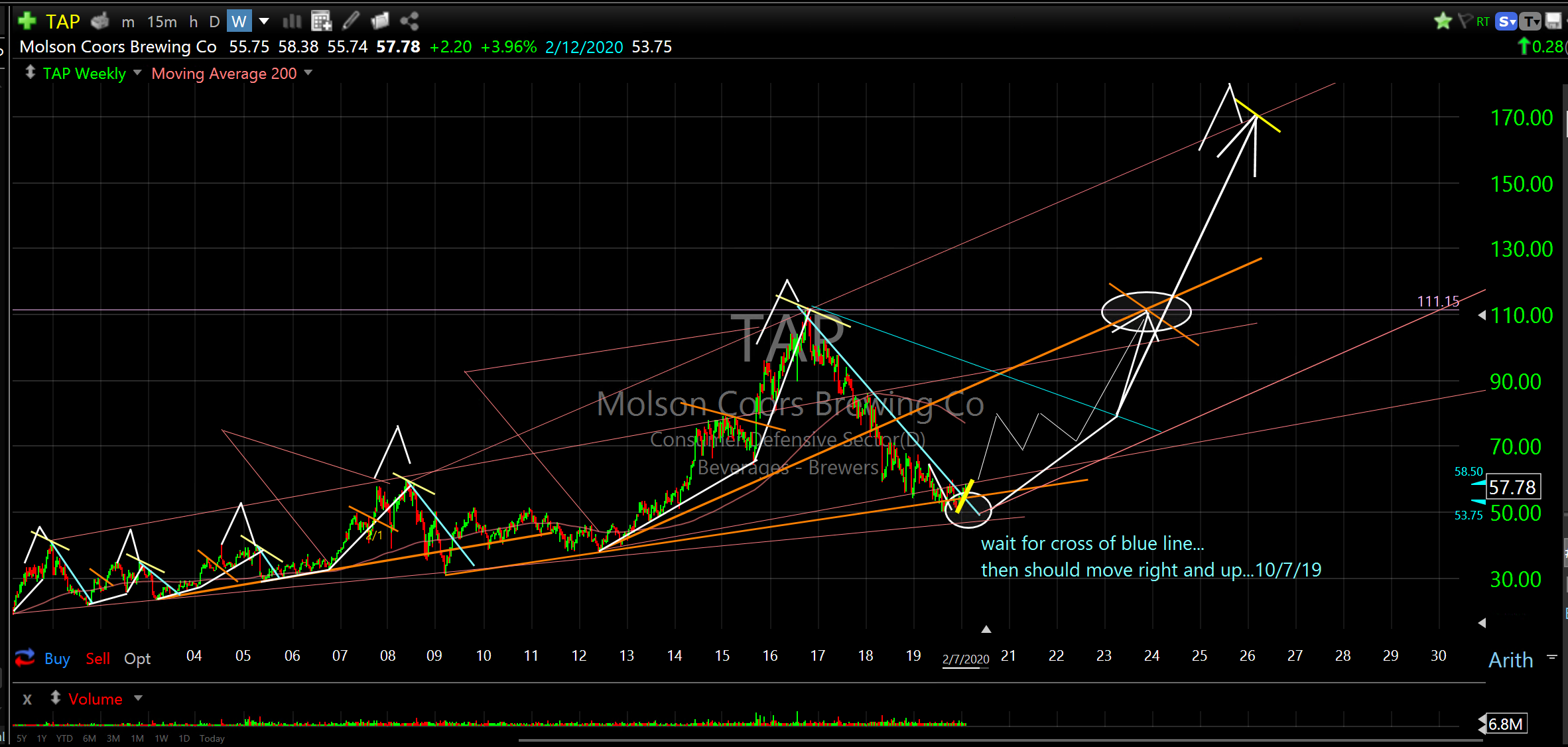
My old neighbor used to run Molson Coors Brewing Co. He was affectionately known as the “Beer Guy”. I’ve been following this company for a long time having lived in Northern Colorado for many years, having had a few cold ones now and again and of course, knowing him.
This company is positioned to begin a long term expansion and it pays a 3.97% dividend. It has a market cap of $12.6B, sales of $10.5B and I remember it tasting pretty, pretty good.
It’s just now crossing over resistance and appears to be beginning a long term bottoming process. Bottoms up!
Molson Coors Brewing Co (TAP)
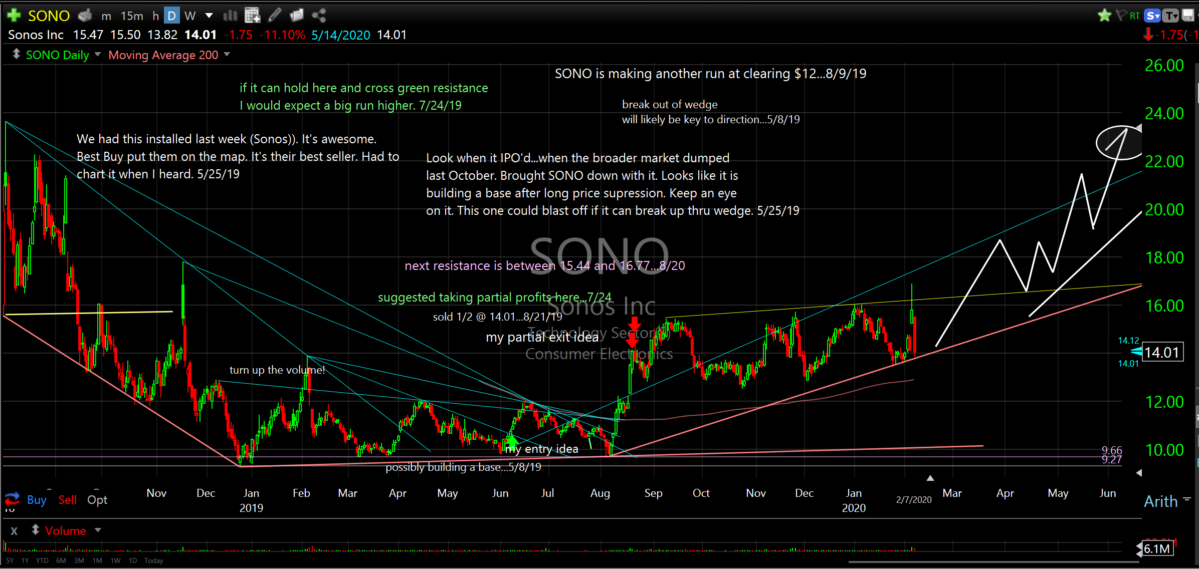
We traded SONO last year for a 28% and 16% gain. You can see our entry (green arrow) and exits (red arrows) aligned almost perfectly with the rip higher last summer. Since then it has been trading in a range between $13 and $15 and made an attempt to break out after earnings release.
It closed Friday right down into support after getting slammed 11% to close at $14.01. This is positioned to ramp to $20.00 in a hurry. Watch for a pop off support soon and if it gets over $16.50 there really isn’t much resistance until $22.00. Caution: if it starts to close under ascending support line that would not be good. Turn it up!
Sonos Inc (SONO)
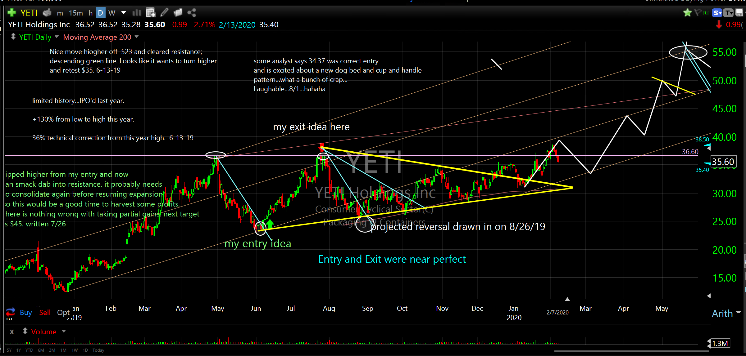
Last summer we made 30% in about five weeks trading YETI Holdings Inc (YETI). It was really as perfect a trade as you can make (see green and red arrows). We bought it right at the low and sold it exactly at the high before it came right back down 27%.
It’s currently positioned to break out of the range it has been in since. It has recently come out of the yellow wedge and is attempting to cross over the old highs which should propel price towards $50 and possibly higher.
The model shows it might need to dip one more time, which times well with the next broader market dip, before ramping up. See price projection on the chart.
YETI Holdings Inc (YETI)
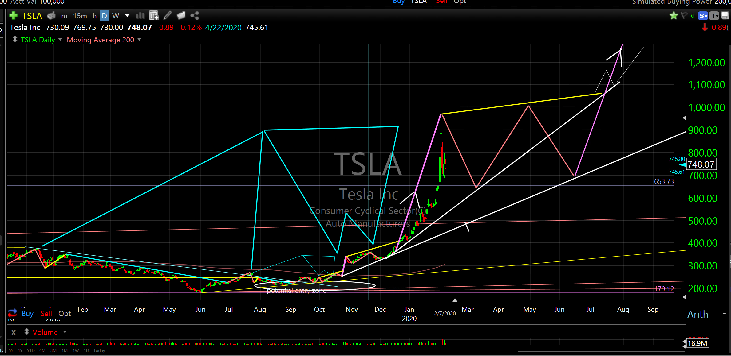
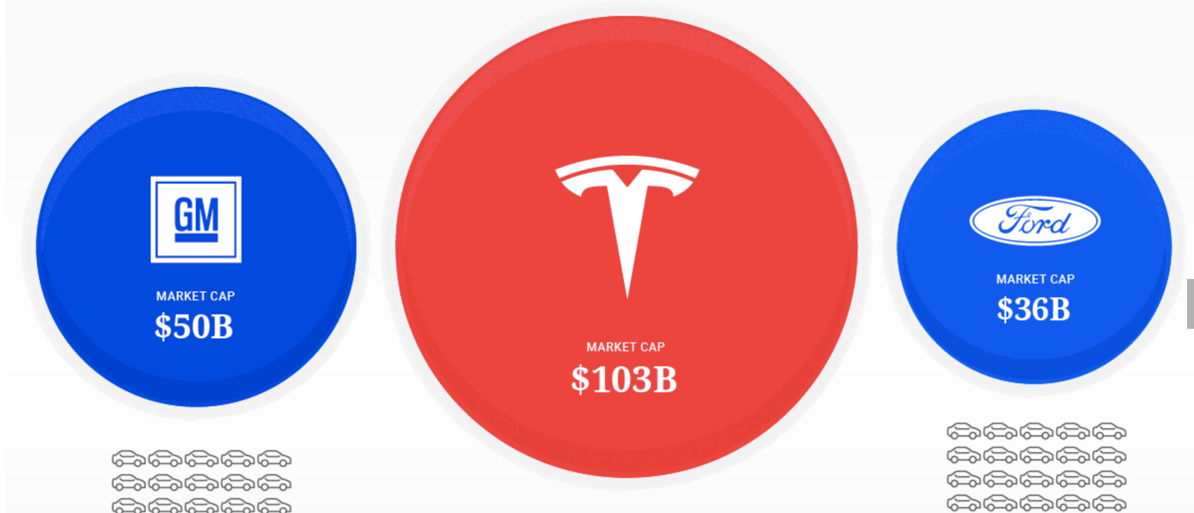
Go Elon! Tesla Inc..Unbelievable!! I am just sick. I knew to buy it. You knew I knew. I talked about it constantly here. I couldn’t pull the trigger. $200 to $1,000 in 3.2 seconds. It’s like a slot car on steroids.
Well, there will be another opportunity and I plan on being there. I think it’s a bit of a gamble now but I will continue to watch it closely. It may be setting up for a much larger move. Zoom Zoom.
Tesla Inc (TSLA)..fractal pattern..2019-2020
Also, check out TSLA’s market cap now vs GM and Ford.
TSLA vs GM vs Ford
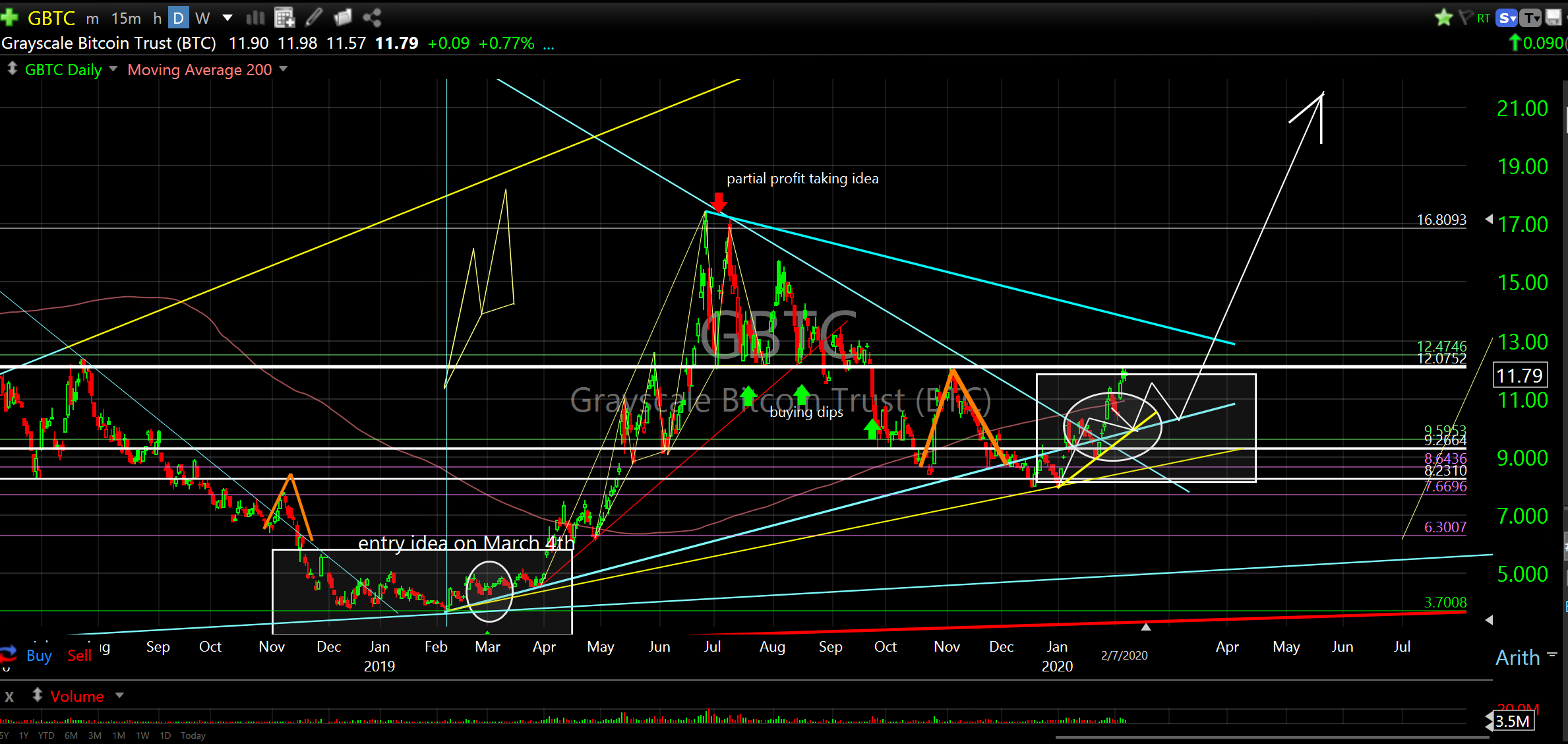
Bitcoin could be at the beginning stage of another large expansion. It recently crossed over resistance and spiked higher right up to the November peak. If it pulls back next week down into the $10.50 area it should spring higher for another attempt to break and cross over $12.00 (current resistance). I would look to enter/add around the $10.50 zone, if it gets back down there.
Grayscale Bitcoin Trust (BTC) (GBTC)
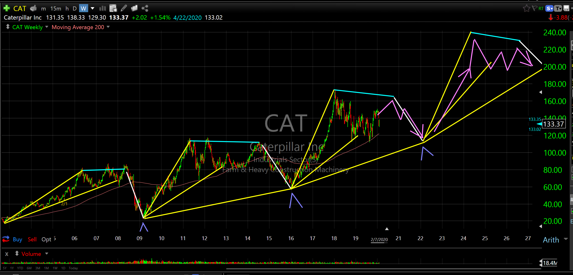
I thought some of you would find the next chart interesting. It’s a long term chart of Caterpillar Inc (CAT) from 2004. It’s a clear example of cycle repetition. Note the symmetry. Note the increase in scale on the way up. Note the expansions, consolidations and collapses inside each cycle. There is so much to learn from this simple chart. Just stare at it for awhile. You will see what 99% of professional analysts don’t see..or are unwilling to see.
Caterpillar Inc (CAT)
Closing Thoughts
Over the past few weeks I have highlighted about 75 ETF’s and individual stocks. To cover all of these individual stocks and all the instruments on the Trade Alert Open (Entries) list is a bit much. Because I want to cover each Entry as closely as possible I am pairing down the ones I am putting on the Entry list.
Going forward, with so many ETF’s and stocks to cover I will likely limit weekly reports to the broader market, current Entries and special situations.
I have built the models on most foreign exchanges, our domestic indexes, sectors, subsectors, individual stocks and ETF’s so it’s really time to just monitor the expansion, the underlying components and my Entry list while staying on the lookout for special situations. Kind of like I always do but with less emphasis on so many new individual stocks.
I sure wish I knew what I know now when I was young but I’m sure grateful I know it now.
Don